この図がたくさんリツイートされているようだが,本当だろうか。
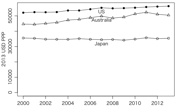
とりあえずOECDの労働力ページの左メニュー Earnings → Average Annual Wages と進んだところのデータの 2013 USD PPPs and 2013 constant prices を使った。
年 = 2000:2013
japan = c(35567,35391,34798,34713,34704,35157,34736,34459,34613,34158,34857,35739,35167,35405)
us = c(52082,52433,52366,52479,53504,53501,54331,55270,54900,55054,55318,55781,56067,56340)
au = c(44652,44463,45056,45700,47268,47749,48822,49838,48553,49218,51272,52333,51050,50449)

plot(2000:2013, japan, type="o", ylim=range(c(0,japan,us,au)), xlab="", ylab="2013 USD PPP")
text(2007, japan[8], "Japan", pos=1)
points(2000:2013, us, type="o", pch=16)
text(2007, us[8], "US", pos=1)
points(2000:2013, au, type="o", pch=2)
text(2007, au[8], "Australia", pos=1)
ほかの国も描いてください。
プロットのところは matplot() を使えばさらに簡単に次のように書ける:
x = data.frame(japan, us, au)
matplot(年, x, pch=c(16,2,1), col="black", type="o", lty=1, xlab="", ylab="2013 USD PPP")
axis(4, x[14,], c("Japan","US","Australia"))
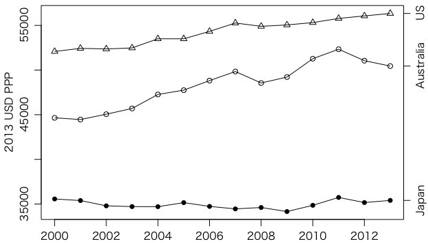
0から始めたければ matplot() にオプション ylim=range(c(0,x)) を付ける。
Last modified: