Sinaplot(シーナプロット)
Sinaplotは、箱ひげ図に代わる統計グラフの一種で、バイオリンプロットの中に個々のデータ点を(水平位置はランダムに)プロットするものです(Sidiropoulos et al, SinaPlot: An Enhanced Chart for Simple and Truthful Representation of Single Observations Over Multiple Classes, 2018)。Claus O. Wilke の Fundamentals of Data Visualization (O'Reilly, 2019) p.87 脚注によれば “The name sina plot is meant to honor Sina Hadi Sohi, a student at the University of Copenhagen, Denmark, who wrote the first version of the code that researchers at the university used to make such plots (Frederik O. Bagger, personal communication).” とのことで、論文第2著者の Sina(シーナ)さんに因むようです。
オリジナルの著者たちによる sinaplot パッケージがR用に作られています。Rのggplot2でもsinaplotが描けます。
Pythonのsinaplotパッケージのインストールは pip install sinaplot です。
パーマーペンギンの体重分布のSinaplotを描いてみましょう。バイオリンプロットを薄く重ね書きしていますが violin=False で消せます。
import seaborn as sns
from sinaplot import sinaplot

penguins = sns.load_dataset("penguins")
sinaplot(x="species", y="body_mass_g", data=penguins)
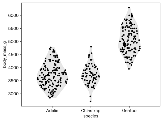
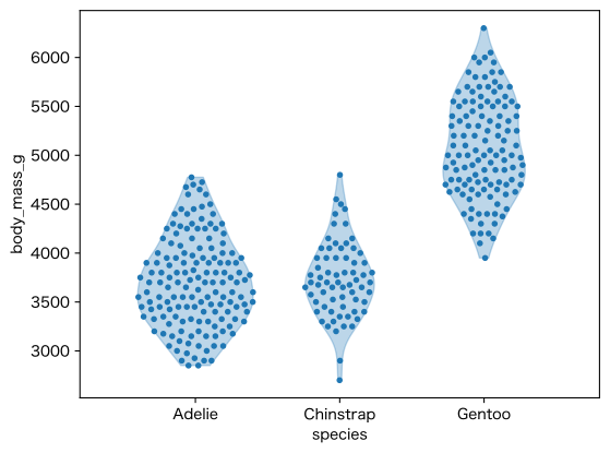
上のものは通常の乱数を使ったもの、次のものは点をなるべく一様に分布させたものです。
sinaplot(x="species", y="body_mass_g", data=penguins, jitter_method="even")
ラベル類を日本語にするには次のようにします:
ax = sinaplot(x="species", y="body_mass_g", data=penguins)
ax.set_xlabel("")
ax.set_ylabel("体重 (g)")
ax.set_xticks([0, 1, 2], ["アデリー\nペンギン", "ヒゲ\nペンギン", "ジェンツー\nペンギン"])
Rのggplot2を模した plotnine パッケージの geom_sina を使ってもsinaplotが描けます。
import seaborn as sns
from plotnine import ggplot, aes, geom_sina

penguins = sns.load_dataset("penguins")

p = (ggplot(penguins, aes(x='species', y='body_mass_g'))
     + geom_sina())

p.show()
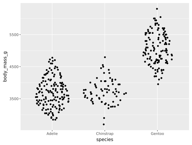
この実装では、ご覧のように、群ごとの点の密度が一定ではないようです。
Bokehを使った例もありましたのでご参考まで。