ROC曲線とPR曲線
ROC曲線をPythonで描いてみよう。まずデータ:
import numpy as np

s = np.array([16,15,14,13,12,11,10, 9, 8, 8, 8, 8, 7, 6, 5])
t = np.array([ 1, 1, 0, 1, 1, 1, 0, 1, 1, 1, 1, 0, 0, 1, 0])
真陽性率と偽陽性率を求める簡単な関数:
# TP / (TP + FN) = sensitivity = recall
def tpr(x):
    return sum(t[s >= x]) / sum(t)

# FP / (FP + TN) = 1 - specificity
def fpr(x):
    return sum(t[s >= x] == 0) / sum(t == 0)
スコアに ∞ をアペンドして,ソートしユニークなものだけ選ぶ:
u = np.unique(np.append(s, np.inf))
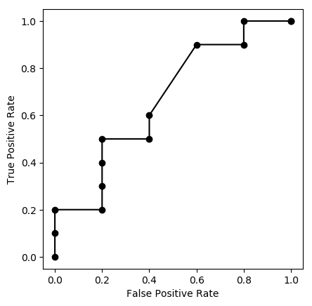
グラフを描く:
import matplotlib.pyplot as plt

plt.plot([fpr(x) for x in u], [tpr(x) for x in u], "ko-")
plt.axis("scaled")  # アスペクト比を1にする
plt.xlabel("False Positive Rate")
plt.ylabel("True Positive Rate")
plt.savefig('190506a.png', bbox_inches="tight")
どの点がどの閾値に対応するかも書き込みたければ次のようにする:
for x in u:
    plt.text(fpr(x), tpr(x), format(x,'g'),
             verticalalignment='top', horizontalalignment='left')
verticalalignment は 'center', 'top', 'bottom', 'baseline', 'center_baseline' から,horizontalalignment 'center', 'right', 'left' から選ぶ。
真陽性率は,検診では感度 sensitivity,機械学習では再現率 recall とも呼ばれる。一方,検診で陽性適中率 positive predictive value と呼ばれる次の値は,機械学習では適合率 precision と呼ばれる:
# TP / (TP + FP) = PPV = precision
def ppv(x):
    return sum(t[s >= x]) / sum(s >= x)
横軸に再現率,縦軸に適合率をとったグラフを,機械学習ではPR曲線(precision-recall curve)と呼び,よく使われる。
plt.plot([tpr(x) for x in u], [ppv(x) for x in u], "ko-")  # PR
plt.axis('scaled')
plt.xlim(-0.05, 1.05)
plt.ylim(-0.05, 1.05)
plt.xlabel("Recall")
plt.ylabel("Precision")
plt.savefig('190506b.png', bbox_inches="tight")
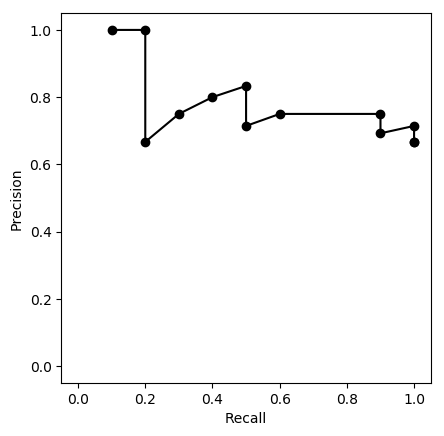
判断の閾値を上げていくと,再現率(「見逃さない率」)はどんどん下がっていく。一方,適合率は上下に変動しながら次第に上がっていく傾向があるが,分母が次第に小さくなって,値が不安定になっていき,最終的には 0/0 になり,定義できなくなる(気にせず 0/0 = 1 として描くのが普通らしいが,上の図では描いていない)。