2021年の共通テスト「地理B」の問題より:
このようなグラフを雨温図と呼ぶらしい。
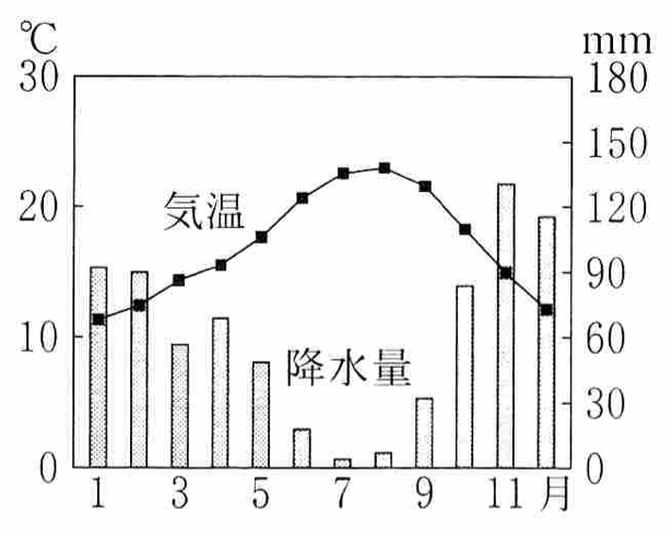
適当な地点の雨温図を描いてみよう。気象庁の過去の気象データ・ダウンロードから,データの種類は月別値,地点は石狩→札幌,項目は月平均気温と降水量の月合計,期間は2019年1月〜12月,表示オプションは適宜設定してCSVをダウンロードすると次のようになった:
ダウンロードした時刻:2021/01/23 09:51:03

,,札幌,札幌,札幌,札幌,札幌
年,月,降水量の合計(mm),降水量の合計(mm),降水量の合計(mm),平均気温(℃),平均気温(℃)
,,,現象なし情報,均質番号,,均質番号
2019,1,86.0,0,1,-3.0,1
2019,2,32.5,0,1,-2.6,1
2019,3,39.0,0,1,2.5,1
2019,4,30.5,0,1,8.0,1
2019,5,29.5,0,1,15.7,1
2019,6,71.0,0,1,17.4,1
2019,7,31.5,0,1,21.7,1
2019,8,144.5,0,1,22.5,1
2019,9,108.5,0,1,19.3,1
2019,10,97.0,0,1,13.3,1
2019,11,82.0,0,1,3.9,1
2019,12,62.0,0,1,-0.8,1
最初の5行を無視して読む:
import pandas as pd

df = pd.read_csv("data.csv", skiprows=5, header=None, encoding="cp932")
       0   1      2  3  4     5  6
0   2019   1   86.0  0  1  -3.0  1
1   2019   2   32.5  0  1  -2.6  1
2   2019   3   39.0  0  1   2.5  1
3   2019   4   30.5  0  1   8.0  1
4   2019   5   29.5  0  1  15.7  1
5   2019   6   71.0  0  1  17.4  1
6   2019   7   31.5  0  1  21.7  1
7   2019   8  144.5  0  1  22.5  1
8   2019   9  108.5  0  1  19.3  1
9   2019  10   97.0  0  1  13.3  1
10  2019  11   82.0  0  1   3.9  1
11  2019  12   62.0  0  1  -0.8  1
気温を折れ線グラフで表示する:
import matplotlib.pyplot as plt

plt.plot(df[1], df[5], "o-")
plt.xlabel("月")
plt.ylabel("平均気温(℃)")

plt.bar(df[1], df[2])
plt.xlabel("月")
plt.ylabel("降水量(mm)")

fig, ax = plt.subplots()
ax2 = ax.twinx()

ax.plot(df[1], df[5], "o-", color="C1", linewidth=3)
ax2.bar(df[1], df[2])
plt.xticks(range(1, 13))  # 全部の月に番号を付ける
ax.patch.set_visible(False)
ax.set_zorder(1)

ax.set_xlabel("月")
ax.set_ylabel("平均気温(℃)")
ax2.set_ylabel("降水量(mm)")
ax.legend(['平均気温'], loc="upper left")
ax2.legend(['降水量'], loc="upper right")

Last modified: